


From Peter Prosen, VP of Managed Services Operations, INOC/Xerox IT Solutions
Almost every IT support team that comes to us to either improve how they work or have us take on their workload has some reporting. That often looks like ticket counts, some measurement of average response time, and an availability percentage somebody drops into a slide deck once in a while.
Then we ask what actually caused last month’s downtime or where the bulk of incidents actually comes from across the infrastructure and the room gets quiet.
That gap is the problem. A count tells you volume, but it doesn’t tell you cause, it doesn’t tell you timing, and it won’t tell you that the same router in the same closet has been failing for three months straight.
We published the full breakdown of our reporting program over on our blog — every standard, optional, and custom report we run, with screenshots of each one. This is the short version: the reports I would want if I were the one buying NOC service, and what each is good for.
One rule before any of it: If you can’t click a number and see the tickets behind it, that isn’t a report. It’s more of a claim. Drill-down is what separates reporting you can act on from reporting you have to take on faith.
Start with the trend line
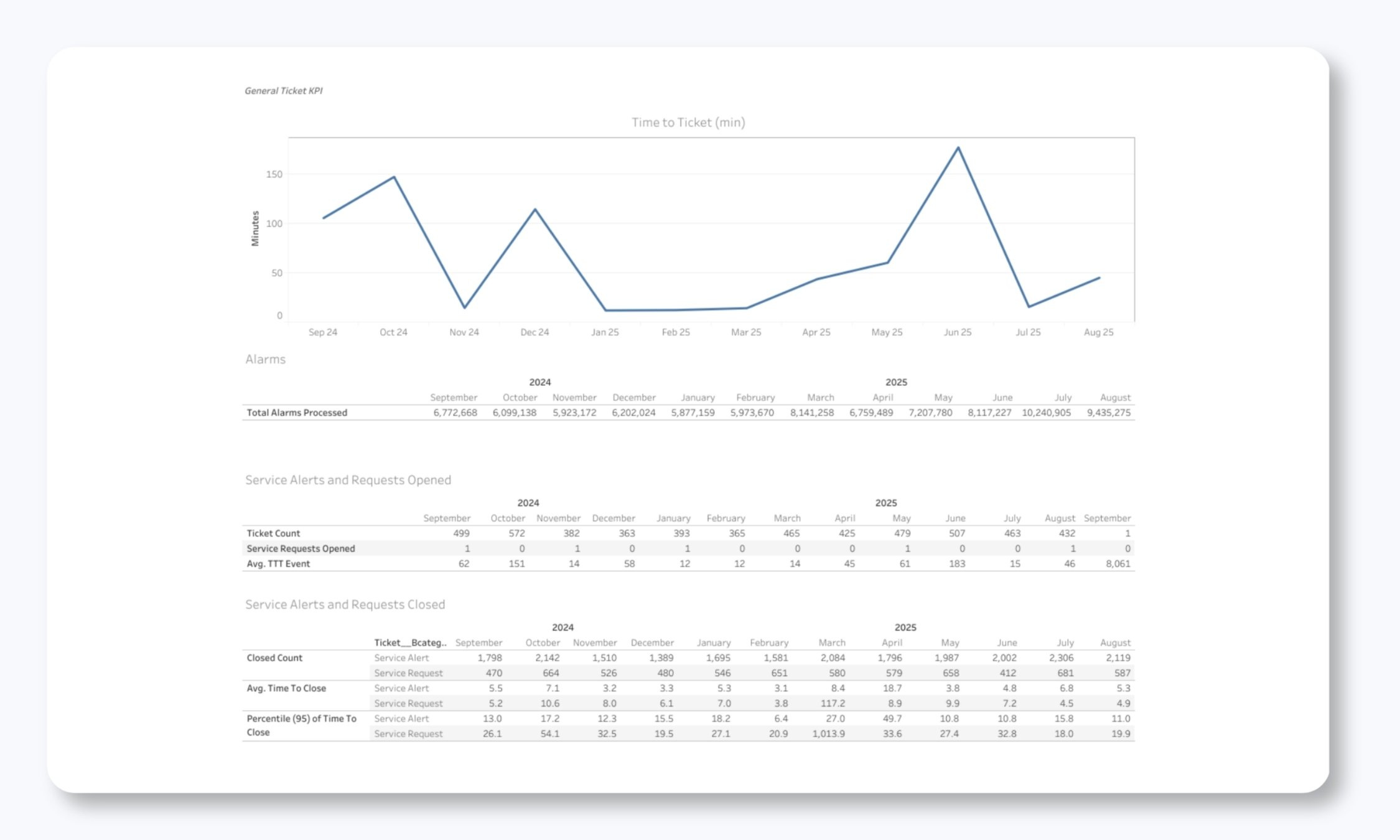
The first screen most clients open shows tickets opened and closed over the past several months, the current open count, and a breakdown by type: monitoring, change, problem, and so on.
The useful number here is direction. Four hundred tickets in a month means nothing by itself. Four hundred this month against 250 in March means something, and it’s worth an hour of somebody’s time to find out what.
Same with the gap between opened and closed. If closed keeps trailing opened, a backlog is forming, and you want to catch that in the report rather than in a staffing argument six months later.
Why the ticket happened
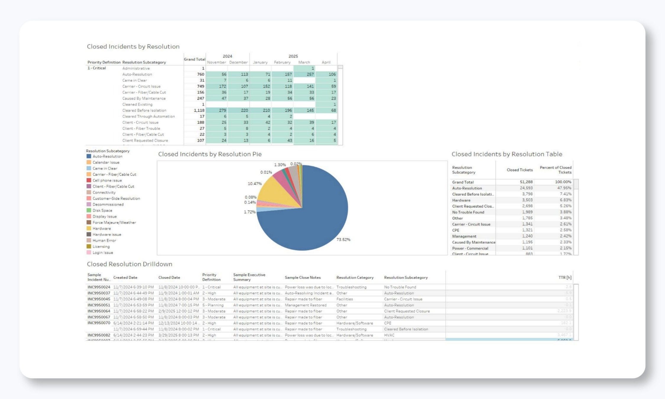
Every closed incident in our system gets a resolution code.
Client hardware or software
Carrier or vendor
Commercial powe
Scheduled maintenance, or the unscheduled kind
Configuration change
Security event
Aggregate those over a few months and chronic problems stop being anecdotes. One carrier sitting behind a third of your P2 tickets over two quarters should be a vendor conversation with evidence attached (and vendors negotiate differently when you bring the data).
Watch the “no trouble found” bucket too. When it climbs, the network usually isn’t the issue — your monitoring thresholds are.
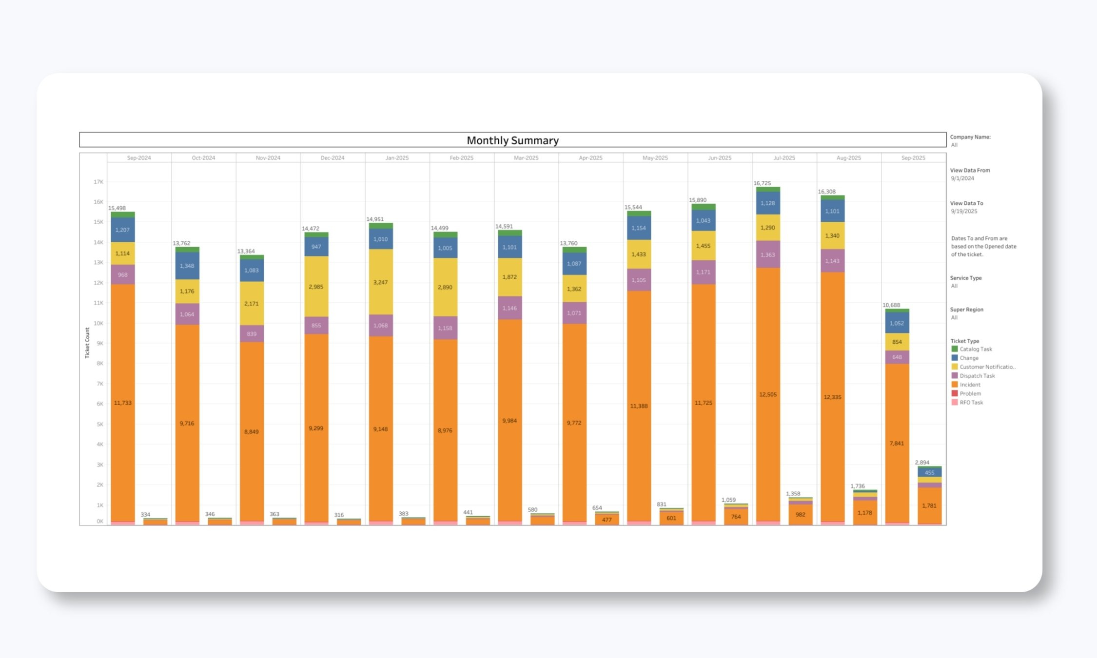
Our monthly ticket report gives a detailed breakdown by ticket type and open/closed status. This report includes full drill-down capability, so you can click any data point to see the actual tickets that make up that number.
This transparency is critical! You’re never wondering what’s behind a statistic, which is one of the prime complaints we hear about prior NOC service providers: the numbers look good, but service feels poor.
When tickets happen
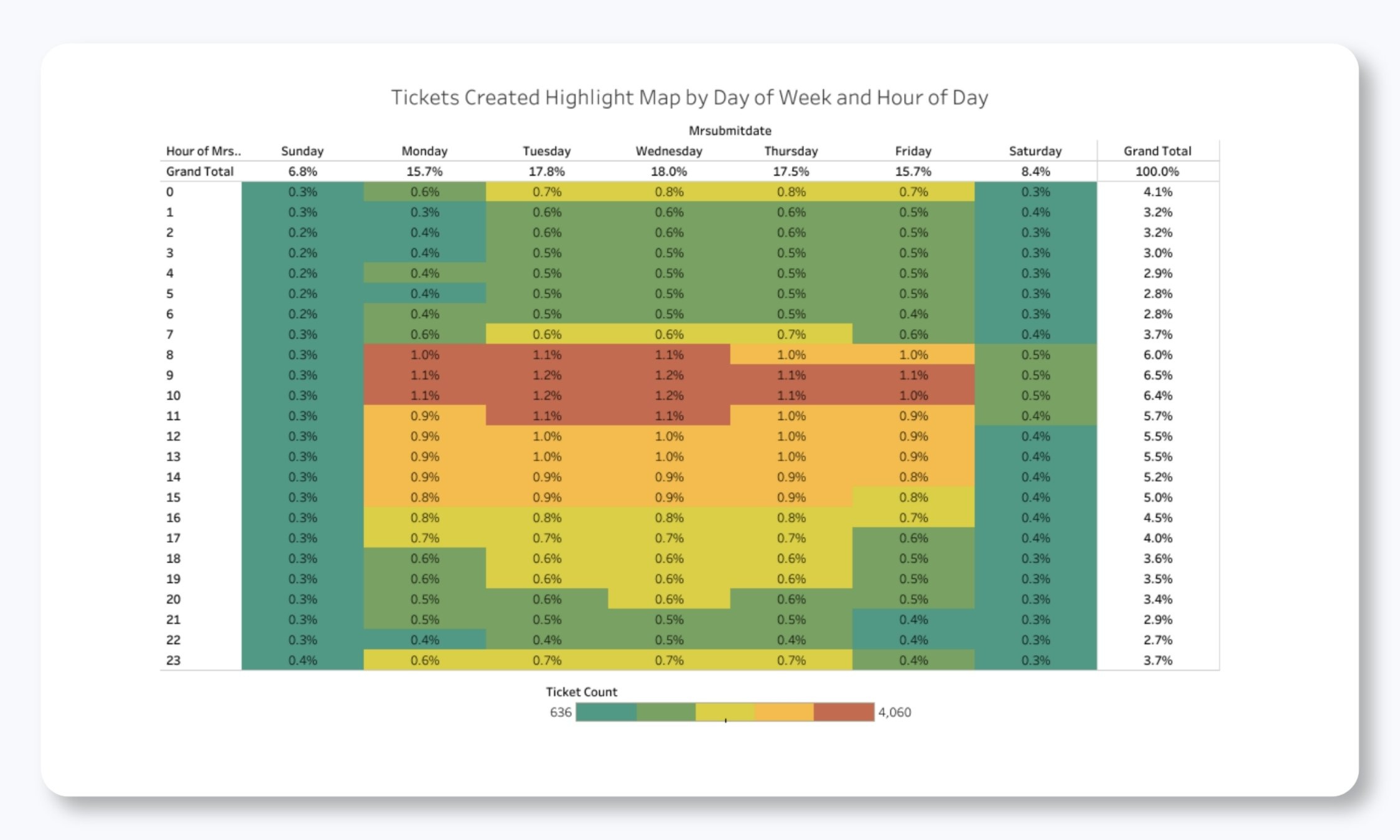
This heat map report breaks incident creation down by priority, day of week, and hour of day. It surfaces patterns that a monthly total buries completely.
If your highest priority incidents (what we call P1s) spike on Tuesday mornings after a weekend maintenance window, look at your change process before you go looking at hardware. If P3s cluster at 9 a.m., that’s people arriving and finding things, which tells you something about what you're monitoring missed overnight.
Of all the reports we walk clients through, this is the one that generates the most follow-up questions. Staffing decisions and maintenance scheduling both come out of it.
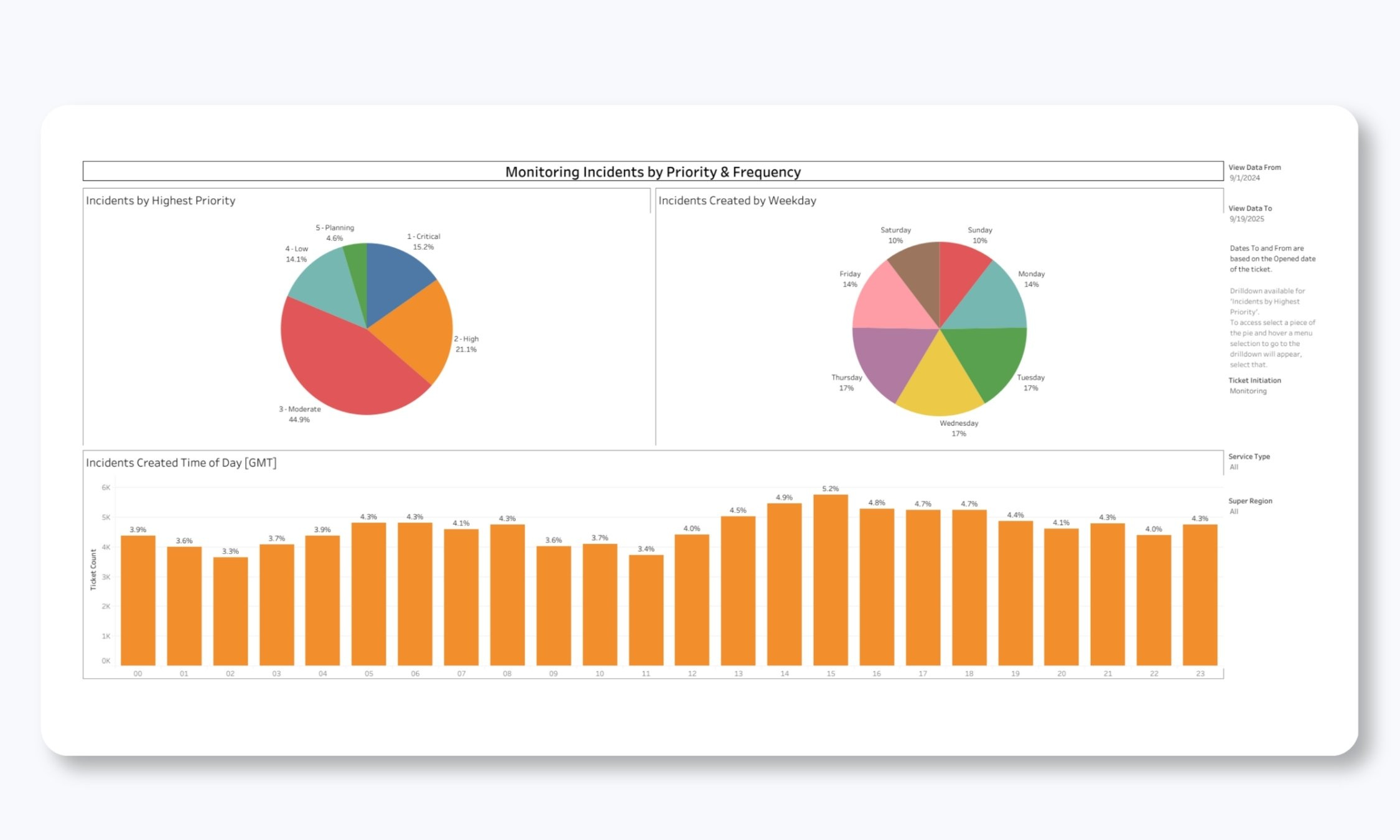
The frequency analysis shows you not just when tickets are created, but how their priority levels distribute across time periods. Now you can understand your true incident profile and finally answer questions that (for most teams) were previously unanswerable.
For example, are most of your issues critical, or are they lower-priority items that can be batched and addressed during business hours?
Every one of these reports includes drill-down capability. Simply click a specific time period or priority level to see the individual tickets that contributed to that data point.
Compliance is pass/fail — the average tells you the margin
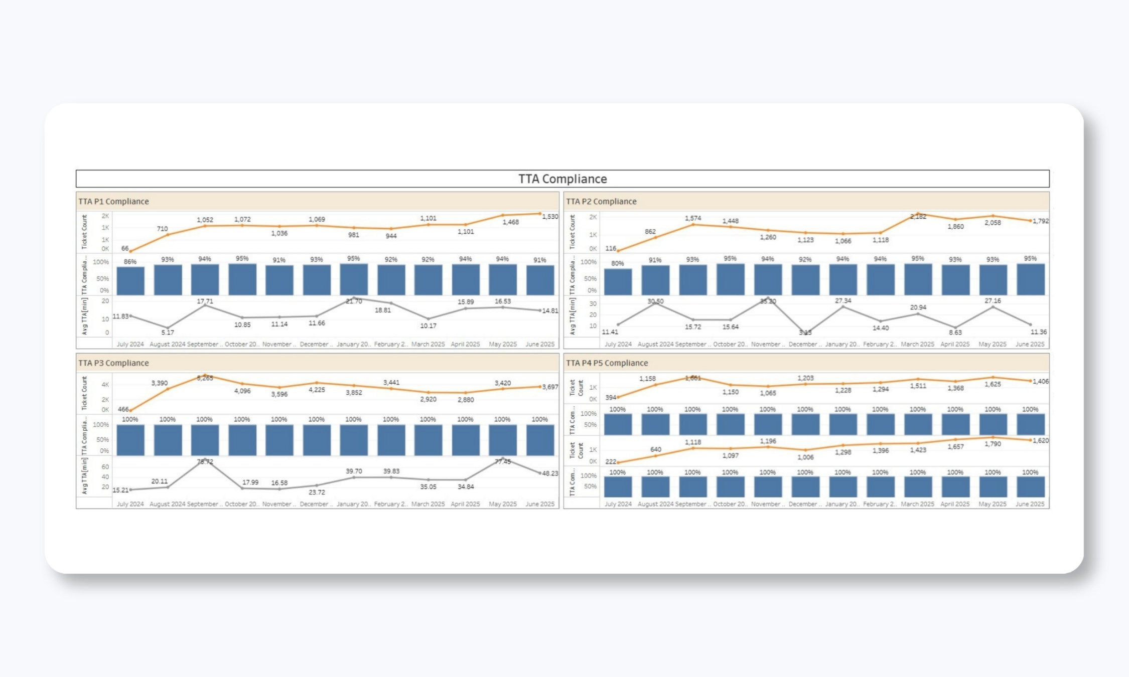
We track Time to Notification, meaning how fast we told you, and Time to Action, meaning how fast an engineer actually started working the incident. Those are two different things, and providers who report only one are usually reporting the easier one.
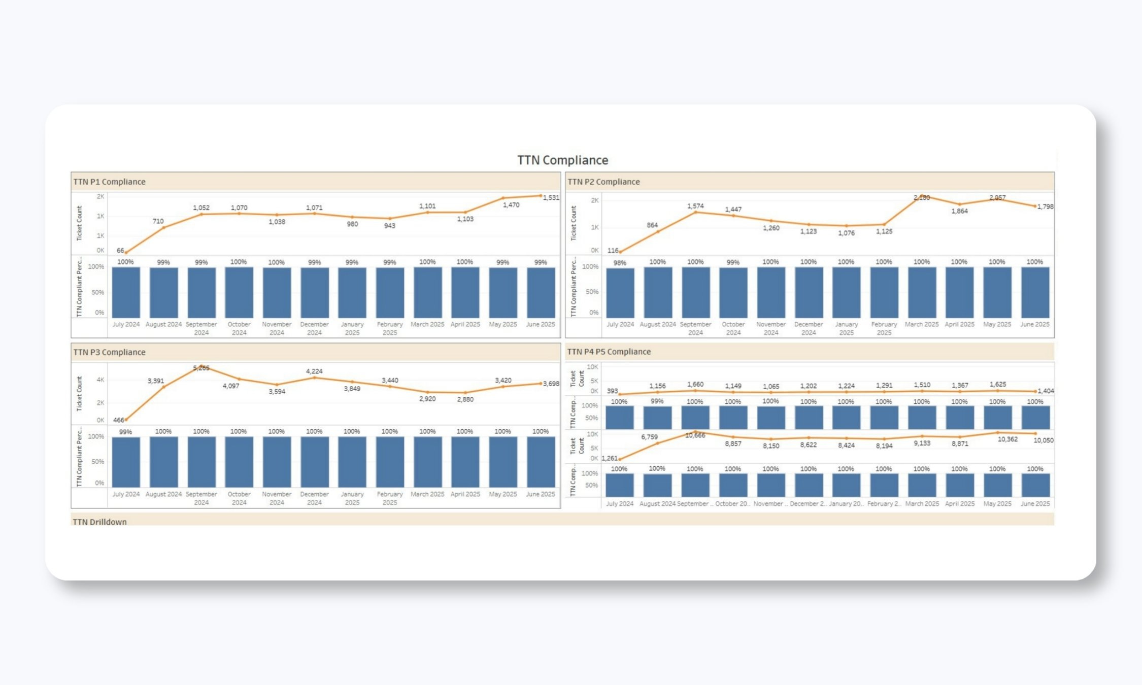
Here’s the part people miss a lot: A compliance percentage is binary. If your P1 target is five minutes, 100% compliance reads exactly the same whether your average is four minutes fifty seconds or forty seconds. One of those has no room left in it. The next bad month puts you under.
So always ask for the compliance percentage and the average, by priority, month over month. Then ask about Time to Impact Assessment: how long before someone identified probable cause, what services were affected, and what the plan was. TTIA is the metric that tells you whether the NOC is thinking or just acknowledging.
The two reports nobody asks for (but everyone needs)
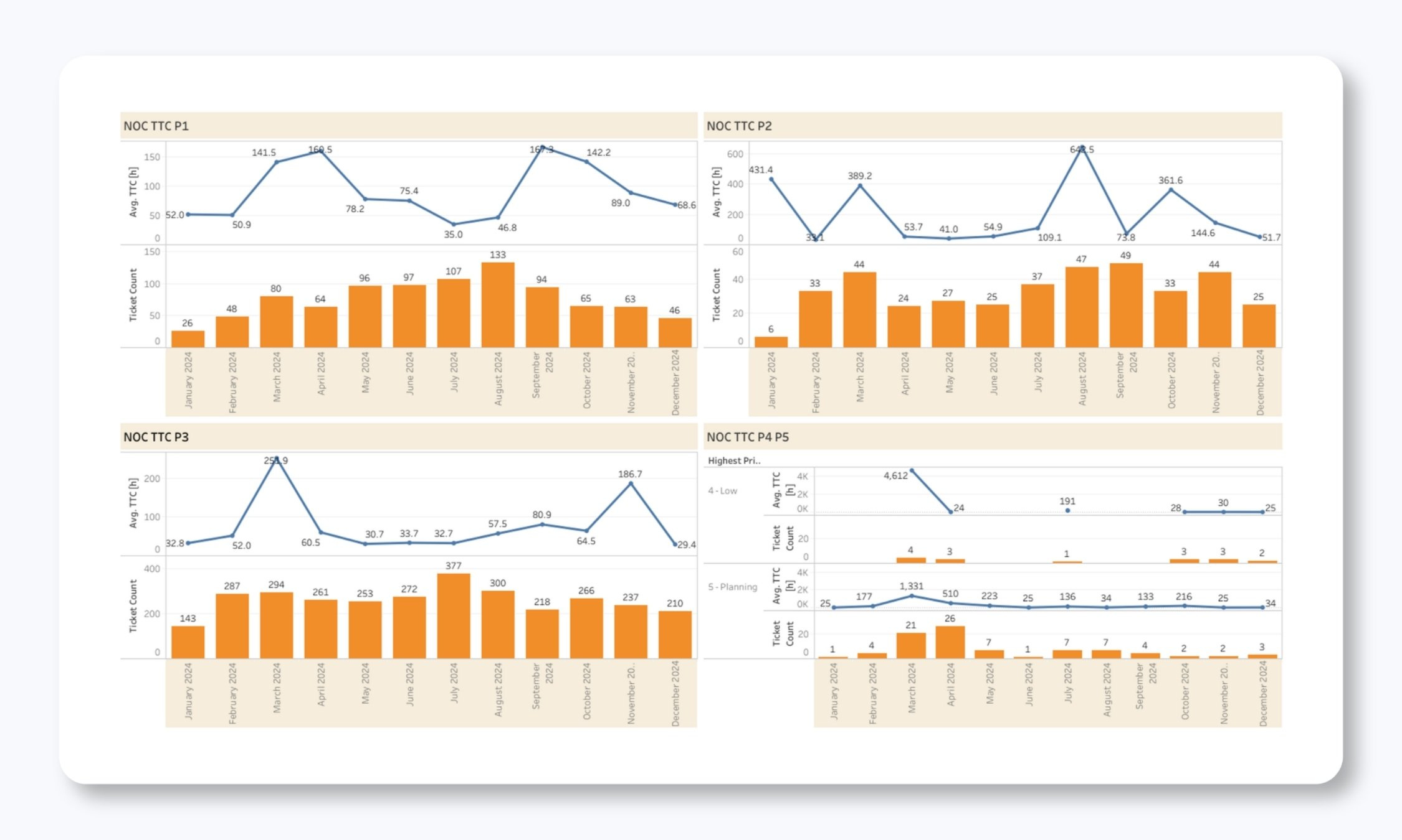
Time to Close covers the entire life of a ticket. Our troubleshooting, vendor escalation, whatever your team had to do, and administrative closure at the end.
Fast Time to Action next to a slow Time to Close is a specific and fixable finding. It usually means tickets are sitting open for paperwork reasons after the technical work is done. That’s a process problem, and process problems are cheaper to fix than engineering ones.
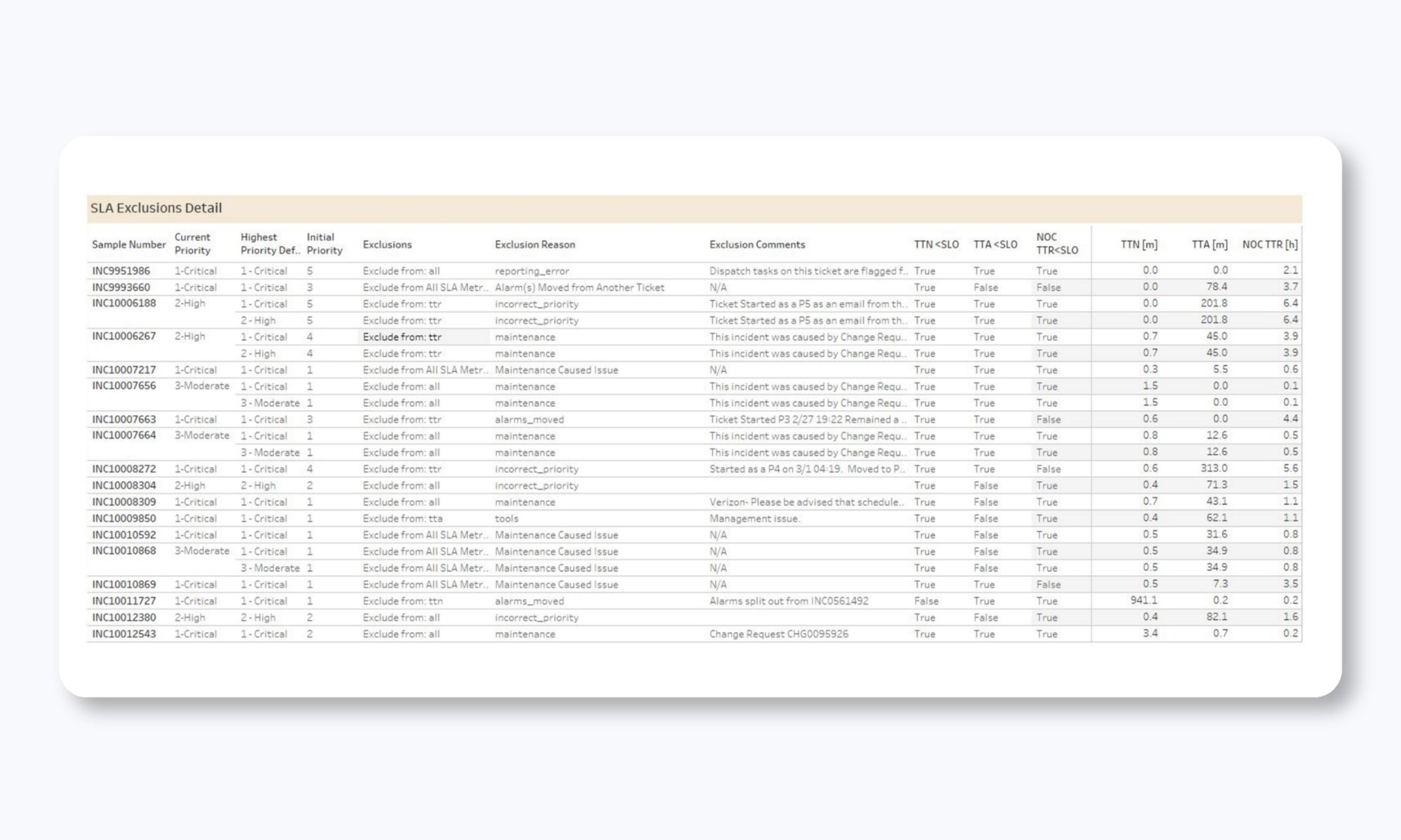
The exclusions report is the one I’d push hardest for. It lists every ticket pulled out of the SLA calculation and why: maintenance windows, client-requested testing, a regional carrier event, duplicates.
Legitimate exclusions exist and we use them. But if a provider can’t produce that list on request, or the list quietly gets longer each quarter, you’re reading a number that has been groomed.
Which devices are actually costing you
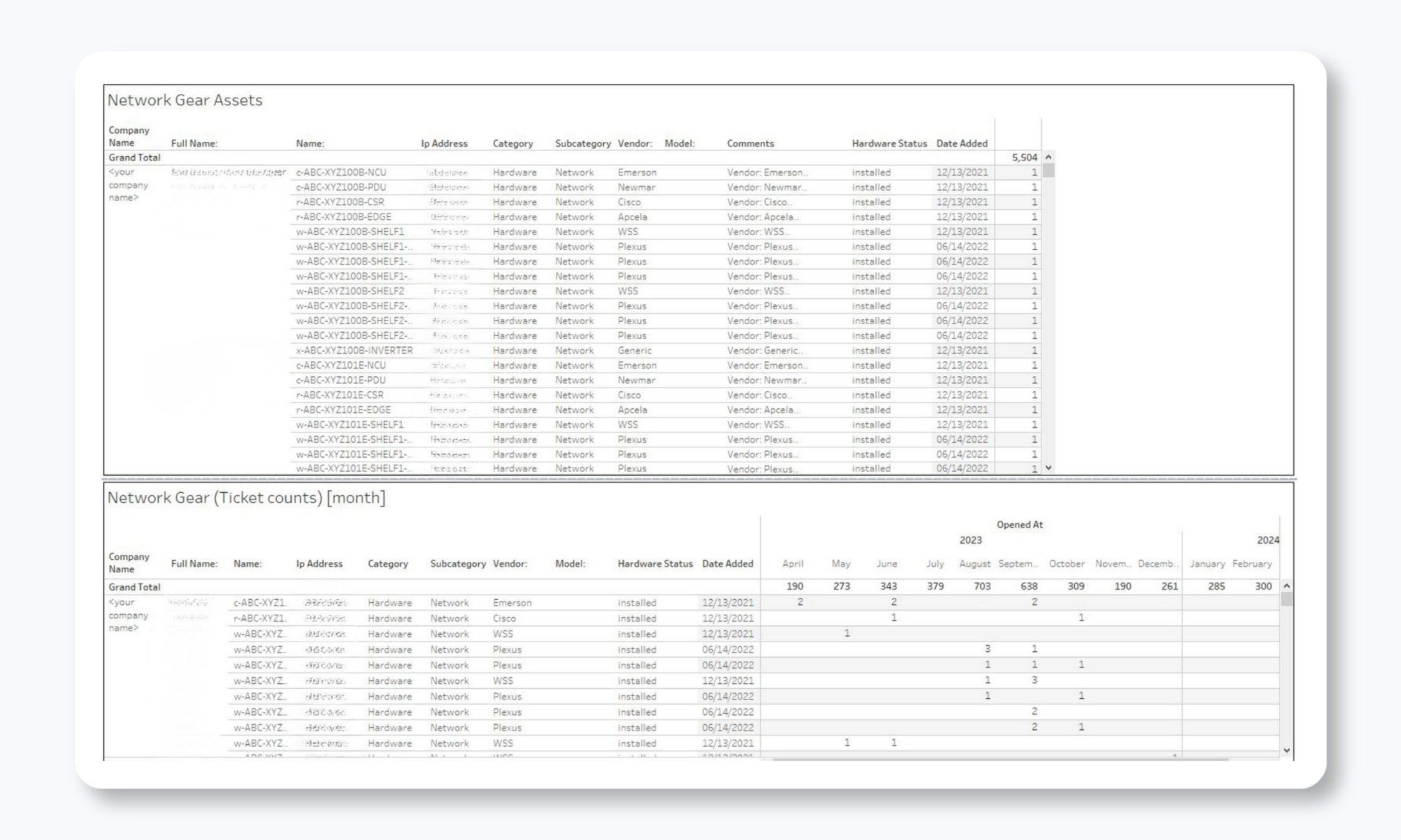
This pulls from the configuration management database, or CMDB: every monitored asset, where it sits, what it is, and how many incidents are tied to it. We create one for every client.
You don’t have 500 devices with a problem. You have about ten devices generating most of your tickets. Once that list exists on paper, replacement schedules stop being guesswork, and budget requests get much easier to defend.
Pay attention to the P3 through P5 alarms while you’re in there. Low-priority alerts get ignored by design, but a device throwing them every week is frequently a device on its way to becoming a P1 at two in the morning.
Call quality and abandonment
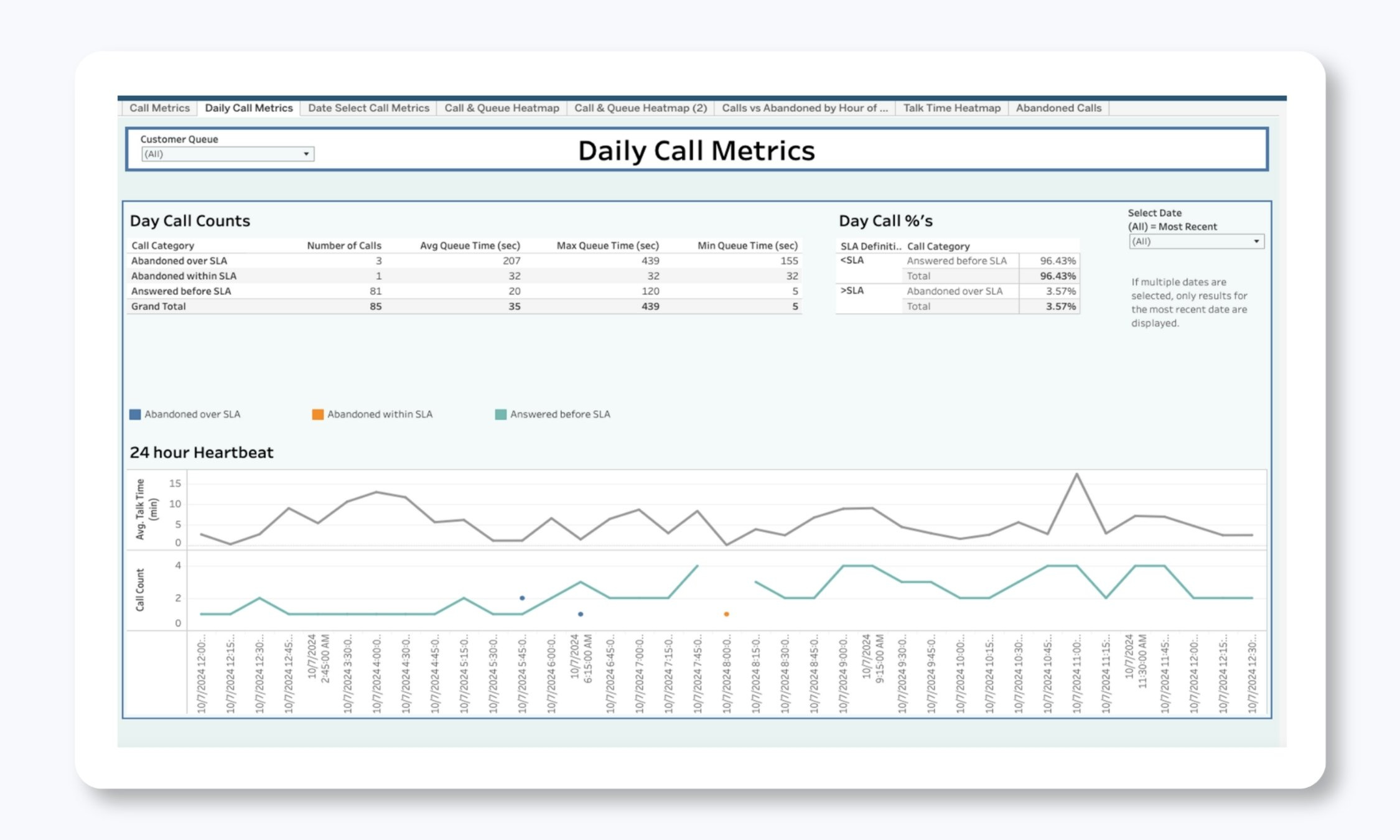
You can hit an answer-time SLA and still be failing callers. We track abandons past two minutes separately from everything else, because someone who waited and hung up experienced a service failure regardless of what the contract says. Those spikes point at staffing or at a volume surge nobody flagged.
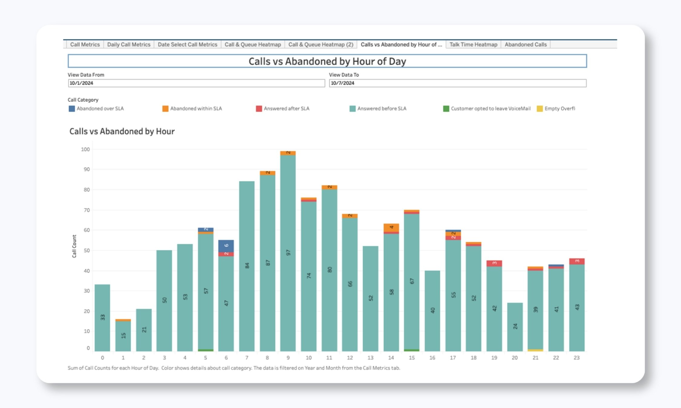
Read our full reporting guide for many more critical dashboards and readouts.
Put these on a calendar!
Having the data changes nothing on its own. I’ve watched teams log into a portal, nod at a dashboard, and close the tab.
The clients who get real return out of this run a standing review, monthly or quarterly, with their own team and their engagement manager on our side. Same agenda every time. Where did SLO performance move, and which direction. What showed up in resolution categories that also showed up last quarter. Which assets are collecting incidents. What in the ticket-timing data should change how we schedule maintenance or where we sit staff.
An hour a month, run consistently, is worth more than a beautiful reporting suite nobody opens. The point of the review is to leave it with two or three things somebody owns and a date attached. Replace that switch. Escalate with the carrier. Move the threshold. Next month you find out whether it worked, which is the entire reason the data exists.
You should be getting this level of insight
If you take one thing from this: the reports worth having are the ones that can embarrass the provider. Exclusions, averages next to compliance, time to close. Any provider can build a dashboard that says the NOC is busy.
The full guide covers all of it, including the standard, optional, and custom tiers we run, screenshots of every report, and how our clients use them in monthly and quarterly reviews.
Read it here: The Complete Guide to NOC Reporting in 2026
And if your current reporting can’t answer the questions above, get in touch. We’ll run a discovery workshop, map where your monitoring has gaps, flag what’s an immediate risk, and give you a right-sized NOC plan with pricing you can actually read.
📄 Also, be sure to read our free white paper that digs into the NOC and ITOps side of this a little deeper: The NOC Improvement Playbook — 10 Common Problems We See and Solve in Our Consulting Engagements

About INOC, a service of Xerox IT Solutions
INOC is an ISO 27001:2022 certified 24×7 NOC and an award-winning global provider of NOC Lifecycle Solutions®, including NOC support, optimization, design, and build services for enterprises, communications service providers, and OEMs. INOC solutions significantly improve the support provided to partners’ and clients’ customers and end users.
INOC assesses internal NOC operations to improve efficiency and shorten response times, and provides best practices consulting to optimize, design, and build NOC operations, frameworks, and procedures. Proactive 24×7 NOC support is provided with several options, including North America, EU, or APAC only or global integrated NOCs. INOC’s 24×7 staff provides a hands-on approach to incident resolution for technology infrastructure support.
Learn more about our NOC support and NOC operations consulting services. Get in touch to start the conversation. We’d love to talk NOC.